
The side of a Central Florida law enforcement agency’s cruisers has that all-important credo, written in large letters – “To Protect and Serve.” “You see this authoritative, confidence-building message,” says Kristy Pennino, professor and chair of Valencia’s Graphic and Interactive Design program. She chuckles. “But they did it in Comic Sans. It’s the perfect font for communicating with fifth or sixth graders. Seventh grade? By that age, we’re all getting too old to be impressed by that.” A classic design mistake, Pennino says – not using the right typescript, a font that’s easy to read and that matches the tone of the message you’re trying to get across. “Whoever did that plainly wasn’t a designer.” We live in a world of design, with everything from the cell phone we use to the car we drive, from the ads we see to the graphics, colors and words we view on websites and in social media. Pennino teaches the people who create those finely honed visual messages. Pennino’s students who earn an Associate in Science Degree in Graphic and Interactive Design learn about fonts that convey messages, colors that reflexively give viewers, readers and consumers “the warm fuzzies,” how to research a graphic assignment and execute a design that underscores the client’s message, with or without words. Pennino, a Virginia Commonwealth University alumna who has been on the Valencia faculty since 2001, sets out to upend her students’ ingrained beliefs about appearances on the first day of the program’s introductory classes. “I ask, ‘Who in here believes you should never judge a book by its cover?’ Most of the class raises their hands. Then I tell them, ‘Guess what? It’s a graphic designer’s job to make us judge something BASED on that first look. Next time you’re in the wine aisle, picking a wine, or deciding what mac and cheese you want for dinner, look at how you’re deciding. Do you want the wine that looks old and distinguished? Do you want the mac and cheese that looks more generic and affordable, or do you want the one that looks expensive, cheesier, better?’ The designer has figured out how we can judge those products, just by the label.” Pennino and her colleagues teach designers-in-training how to visually brand themselves, a company, an organization or a product. Students learn how to go about creating a design that will do what they intend it to do by documenting every step – brainstorming, doing research, rough sketches, refining those sketches. “Design is a process, not a result,” Pennino says. Every class she teaches has its own Facebook page where classmates pick each other’s brains and critique each other’s works in progress. Alumni go on to four-year or advanced degree programs, and end up in ad agencies or media companies such as MTV. You learn to accept “that design is subjective,” says 2013 graduate Bryttni Wolfe, who now works at Echo Interaction Group in Orlando designing mobile applications for Android phones and operating systems. She credits the rigorous process of creating a portfolio, judged by classmates and faculty at Valencia, for landing her that job. Pennino and others taught her that the “process” involves a lot of people and a lot of opinions – “the design firm you work for, the client hiring that firm, co-workers.” Pennino says that the hardest thing students with an artistic bent have to do is explain what they’re studying to their parents. It’s art that sounds like psychology. “We use the techniques of fine art, the understanding of color and texture to communicate our ideas,” Pennino says. “We make your eye go where we want it!” And, her students learn, where the eye goes, the mind follows. “If you look at BP’s logo, the one that looks like a flower, it’s very hard to associate ‘big giant oil spill’ with a logo that looks like a daisy,” Pennino says, citing a classic example of a company that needed visual “re-branding.” That new logo’s shape and colors influence opinion of BP. “I want students to know how to do that, but to realize, as ‘Spider-Man’ learned, that with great power comes great responsibility.”// BY ROGER MOORE
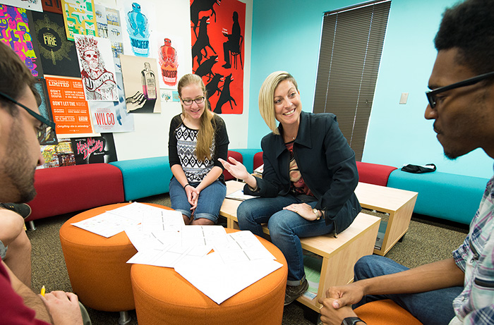
Kristy Pennino critiques poster ideas from students Rebekah Rigel and Shai Nesmith in an advanced graphic design class.
We use the techniques of fine art, the understanding of color and texture to communicate our ideas. We make your eye go where we want it!”
Kristy Pennino
Teaches Students
Better Communication by Design
Better Communication by Design